Ian James Andersen

view more

Pup of Joe

Café for Dogs & Their People

A coffee shop that caters to dog people, specifically by providing a special menu for dog snacks and drinks. I created the concept inspired by the growing popularity of dog and cat cafés, but wanted to create a place your dog would be as excited to visit as you are to take them there.

Client

Pup of Joe (School Project)

Outcome

Identity, Menu, & Packaging

view more

Star Hopper Brewing Co.

Brews from the far reaches of the cosmos.

Craft beer based around the concept of the ingredients being gathered from the far reaches of space. A series of bespoke illustrations of spaceships give each bottle a charming character along with subtle indications of the beer’s flavors. Each beer features a different brewing ship to help customers identify the different brews based on color, the complex illustrations are eye-catching and meant to be explored as the customer drinks the different beers. The narrative behind the brand is further expanded in the copy which uses space exploration and resource gathering terms to talk about the beers' different flavor profiles.

Client

Star Hopper Brewing Co. (School Project)

Outcome

Identity System, Packaging, & Illustration System.

Awards

Winner for Best Overall Campaign at DSVC NSSC 13

view more

Mateo's Salsa

Texas inspired salsa, chips and mixers.

Packaging for Mateo's reflects the brand's unique flavor by referencing the unique and mythical animals from Texas. The illustrations were influenced by the work of painters like Joan Miró and Jean Arp, taking both real and mythical Texas wildlife and abstracting them into a brightly colored series of landscapes which reflect the flavor profile of the product.

Client

Mateo's Gourmet Foods (School Project)

Outcome

Packaging system applied to Salsa Jars, Drink Mixers, and Chip Bags along with Logotype and Lettermark

Awards

Included in Packaging category of DSVC NSSC 13

view more

Houston Arboretum

Preserving the wildlife of Houston for future generations.

Built in downtown Houston, the Arboretum and Nature Center offers an escape from the city without having to travel out of town. This 155-acre non-profit urban nature sanctuary provides education about the natural environment to people of all ages. It plays a vital role in protecting native plants and animals in the heart of the city where development threatens their survival. The Houston Arboretum is a private non-profit educational facility that operates city land.

Client

Houston Arboretum (School Project)

Outcome

Identity, Website & Posters

view more

Let Loose

Happy chickens make good eggs.

A campaign designed to bring egg farmers and retailers together in order to encourage customers to purchase ethically raised eggs. Based around extended brand interaction and based on ethical standards, Let Loose aims to make customers feel good about buying eggs from farms that follow humane practices. The Let Loose brand identity is built around the illustrated chickens that work across the packaging and in accompanying promotional materials to carry the brand message.

Client

Animal Welfare Association (School Project)

Outcome

Identity System, Packaging, Promotional Campaign, Mobile Application and Research Document

view more

Freedman's Memorial

The history, loss, and rediscovery of a cemetery.

Once one of the largest communities of former slaves in texas, the history of Freedman's Town has been obscured by discrimination, segregation and gentrification.

Client

Freedman's Memorial (School Project)

Outcome

Identity & Website

view more

University of North Texas Libraries

Encouraging students to make the most of the unique opportunites of their University Libraries provide.

Work created as a designer working for the UNT Libraries, I created marks to promote various events along with creating campaigns to promote events using both print and digital materials.

Client

UNT Libraries

Outcome

Various Identity marks and illustrations to promote UNT Library events

view more

In the Penal Colony

The story of the worst form of torture, bureaucracy.

Series of magazine spreads for Franz Kafka's 1914 short story In the Penal Colony which emphasize the complex bueracracy of the torture process Kafka describes. I also wanted to convey the gritty reality of the scene Kafka describes; an offensively filthy and neglected penal colony contrast with the elaborate mechanisms of the torturous execution device the narrator describes.

Client

The New Yorker (school project).

Outcome

Three printed magazine spreads.

view more

Rogue Lands

A collaborative adventure through a fractured world.

Rogue Lands is a collaborative adventure board game based on the idea of world which has come apart at its seams and descended into chaos. Rogue Lands allows players to take on a character role and work together to restore order to the game land by defeating monsters, overcoming traps and collecting treasure. Inspired by games like Dungeons and Dragons, and Munchkin, I wanted to create a boardgame of my own but focus on creative role-playing and player co-operation. Rogue Lands was created as the first game by games publisher Tiger Mountain

Client

Tiger Mountain Games Presents Rogue Lands (School Project)

Outcome

Board Game design including illustrated playing cards, packaging for the various game pieces and the game box, and a website dedicated to the game.

view more

Sound Dust

New Music, Old Format.

Identity system and website for Sound Dust, a monthly cassette tape subscription service with new music.Sound Dust offers subscribers the chance to hear new music before it is released elsewhere on a custom made cassette tape. I created the concept and an accompanying identity system along with the illustrations to the products Sound Dust offers.

Client

Sound Dust (school project).

Outcome

Identity, Packaging, Website and Illustrations.

view more

Tiger Mountain

A board game company that specializes in adventure games.

Tiger Mountain is a board and card game company that creates a variety of fun table top games. I created the Tiger Mountain to be the top level company that publishes the game Rogue Lands which was designed as part of this project. I focused on making the mark recognizable so that players can easily find Tiger Mountain products at their local game store. The company name was inspired by the Brian Eno song of the same name and the adventure it invokes.

Client

Tiger Mountain (School Project)

Outcome

Identity, Stationery Set and Website.

view more

Twisted Dog Pretzel Co.

Woof Woof.

A Pretzel company based out of Fort Worth that prides themselves on the quality of their pretzels but aren't over serious about it, which is conveyed by their fun and playful name.

Client

Twisted Dog Pretzel Co (School Project)

Outcome

Identity Mark

view more

Comic Book Legal Defense Fund

Protecting the rights of comic artists, retailers and readers.

Digital Publication for The Comic Book Legal Defense Fund focusing on the growing importance of comics as a medium in modern society, and the challenges they face, along with how to help protect work from censorship.

Client

CBLDF (school project).

Outcome

Digital Publication (PDF).

view more

Gill Sans Type Handbook

A popular typeface that has survived despite the legacy of its creator.

An original guidebook to effectively using the typeface Gill Sans, along with a brief history of one of the world's most famous typefaces. The book is designed using only the typeface Gill Sans, it's meant to be both a guide to how the make the best use of the font and showcase places which make the best use of the typeface. Gill Sans has been used poorly many times it has given the typeface something of a negative reputation, especially when the ultrabold comes into play. This book is meant to restore the reputation of the typeface, even if its creator is irredemable.

Client

Type Specimen Books (school project).

Outcome

Perfect Bound Book

Awards

Included in Publication category of DSVC NSSC 12

view more

Eye Candy Optics

Make your eyes look sweet as candy.

Rebranding of Eye Candy Optics, a trendy eyewear shop in downtown Chicago. The identity marks for Eye Candy Optics are based on the same pun the store uses focusing on the "sweet" nature of the eyewear they carry. I focused on making the various marks both charmingly sweet while also elegant to match the qualties valued by Eye Candy Optics’ owners and employees.

Client

Eye Candy Optics (school project).

Outcome

Logotype, Identity Mark, and Stationery

view more

Cups & Crepes Menu

A delicate menu for a these savoury & sweet delicacies.

Menu design and identity mark for Cups and Crepes, a restaurant established on the first floor of a Victorian era house in Denton Texas, specializing in breakfast, lunch, and specialty coffees. The design of the menu and identity mark were informed by the delicate nature of the crepe and the details of the Victorian house the restaurant is operated from. The type, decorative elements, and color pallet were chosen to reflect the refined nature of the menu items being served to evoke the pleasent and casual atmosphere of the establishment.

Client

Cups and Crepes (school project).

Outcome

Menu Design and Identity Mark

view more

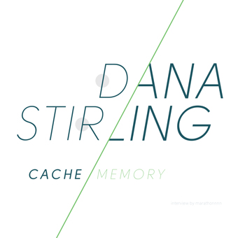
Dana Stirling Patron Magazine

A photo series exploring memory and what photographs both reveal and hide.

A series of spreads showcasing photographs from Dana Stirling's Cache Memory series for Patron Magazine. The layout and typographic structure are inspired by concepts behind the photo series. Stirling's photos explore ideas surrounding how we process and retain memories and how photographs can contain and hide things.

Client

Patron Magazine (school project).

Outcome

Print Magazine Spreads

view more

ALDI

A streamlined grocery experience.

A redesign for the grocery chain ALDI using a new identity system designed to emphasize the ALDI's commitment to efficency and order.

Client

ALDI (school project).

Outcome

Identity System, Stationery Set, and Perfect Bound Book.