Ian James Andersen

Mateo's Salsa

Texas inspired salsa, chips and mixers.

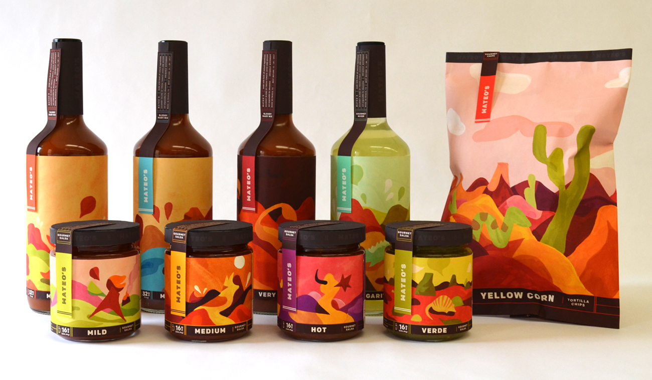
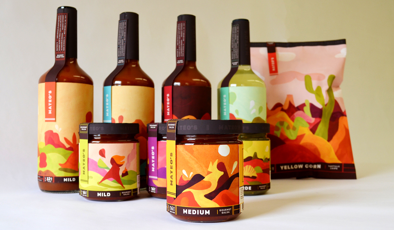
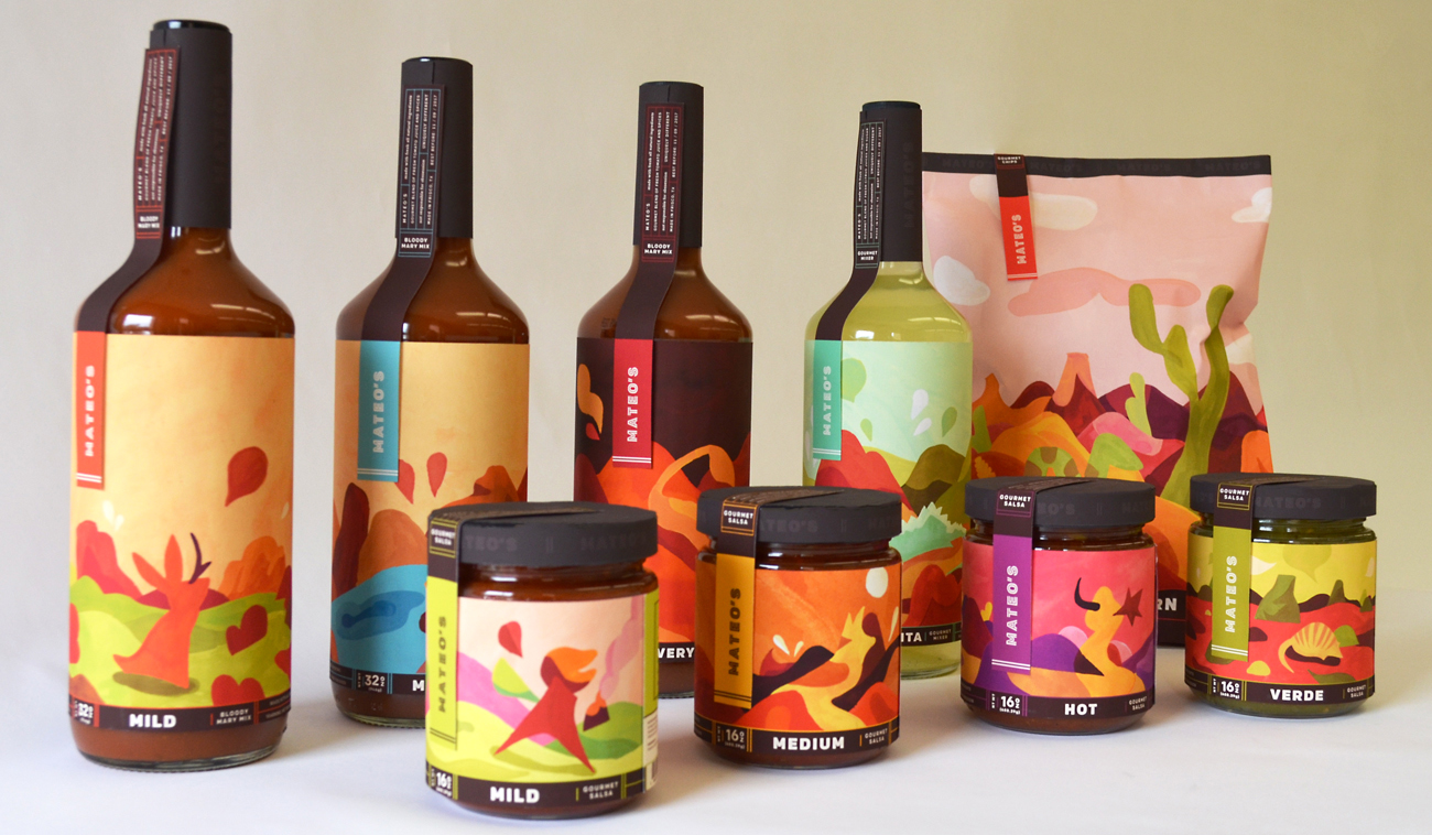
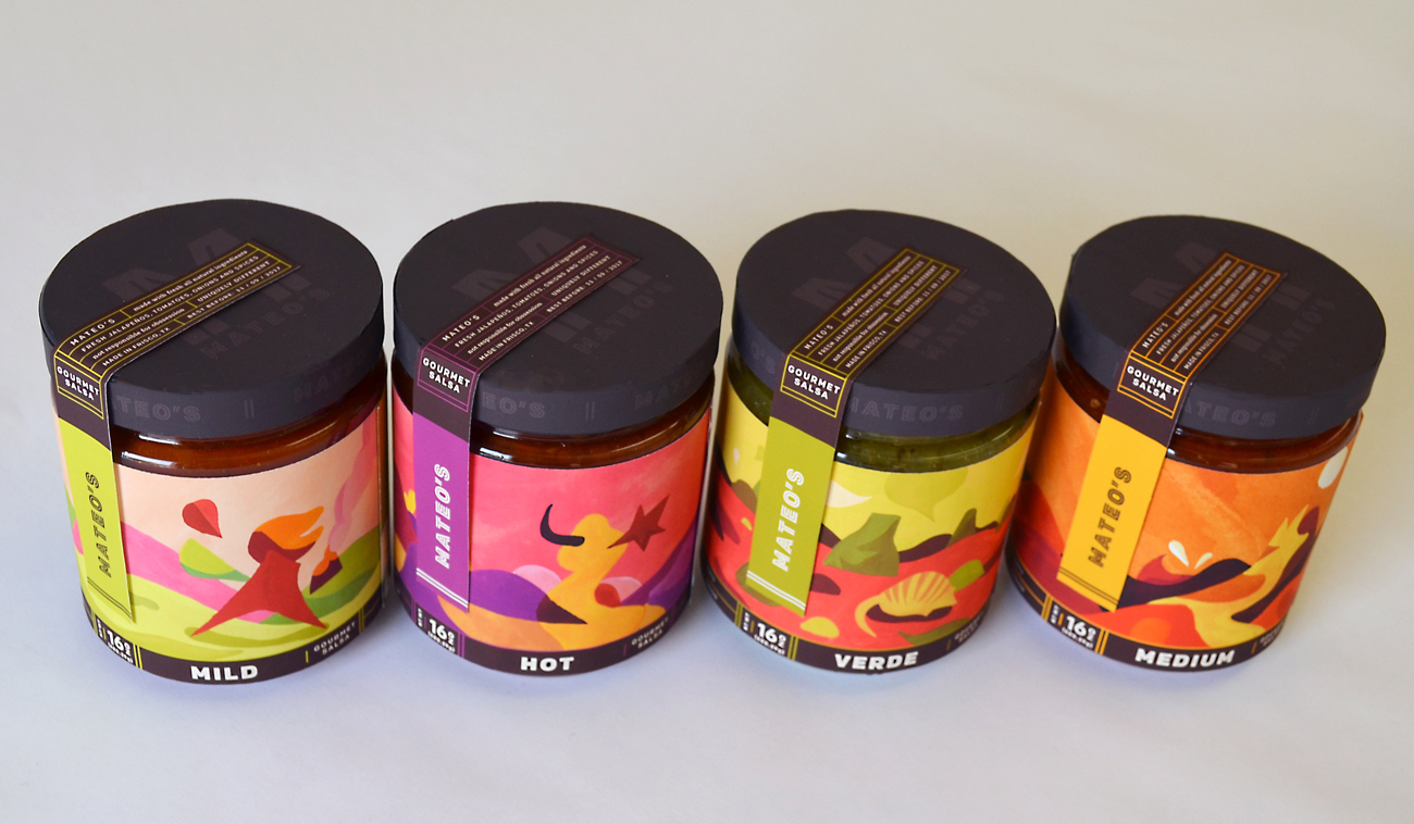
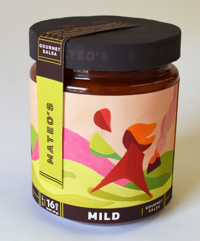
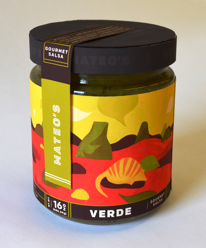
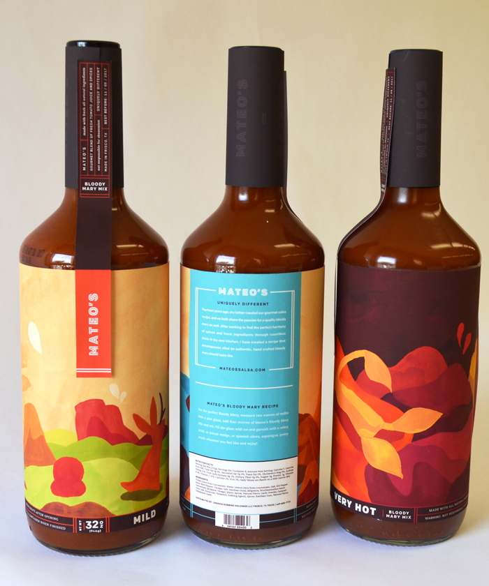
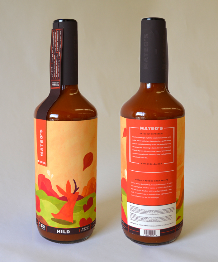
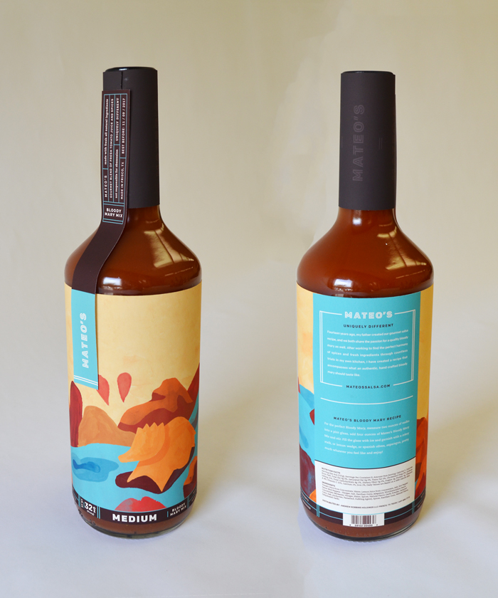
Packaging for Mateo's reflects the brand's unique flavor by referencing the unique and mythical animals from Texas. The illustrations were influenced by the work of painters like Joan Miró and Jean Arp, taking both real and mythical Texas wildlife and abstracting them into a brightly colored series of landscapes which reflect the flavor profile of the product.

Client

Mateo's Gourmet Foods (School Project)

Outcome

Packaging system applied to Salsa Jars, Drink Mixers, and Chip Bags along with Logotype and Lettermark

Awards

Included in Packaging category of DSVC NSSC 13

Brand Positioning

Mateo's products are designed to set themselves apart from other more typical salsas, after researching Mateo's target audience and analyzing their competition, I developed packaging based around playful illustrations of abstracted animals in a mythical Texas desert.

Research

Before designing packaging for Mateo's products, I determined Mateo's current position in the Salsa market and their target market. Mateo's wants to position itself as a unique alternative to other blander salsas through their use of all natural ingredients and one of a kind taste. Because Mateo's founder was born and raised in Texas, and his salsa is based on his father's recipe I wanted to move away from the common tropes within salsa packaging of relying on distressed wood-type coupled with engraved illustrations which reference the Texas of the past. I also wanted to avoid cliche stereotypes of traditional Mexican culture, because Mateo's is creating a uniquely Texan type of salsa.

Target Audience

To have a clearer picture of Mateo's audience I took into consideration the fact that their salsas are made using only natural ingredients and don't contain artificial preservatives. Their products have a higher price point than other tomato paste based salsas, and are sold as a gourmet product. I also wanted to give them a playful spirit because salsa is often served as an appetizer or party snack. With this in mind I established a target demographic who are interested in quality foods and enjoy hosting smaller parties with friends and acquaintances.

Brand Presence

Mateo's products are distinguishable on the shelf through the combination of the brand identity mark, the illustration style and the consistent approach to typographic arrangement.

Marks

The lettermark and logotype convey the gourmet quality of the brand through their clean letterforms and detailed inline. While the branding is downplayed through tone on tone and the position of the brand name, the use of repetition solidly links the packaging to the brand.

Illustration

The illustrations play an important role in establishing the brand's recognizablity, the related color palettes and consistent level of abstraction and repetition fo elements work together to make a Mateo's product easy to pick out on the shelf.

Typography

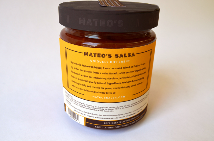
The typography portrays the bold flavors of Mateo's products in a clean way, along with the communicating the brand's principles of using fresh ingredients to provide a unique experience. The tags on each product contain information that relates the brand promises of commitment to using fresh ingredients in order to create quality products.

Imagery

The illustrations for Mateo's were inspired by the work of modernist artists like Jean Miró and Jean Arp, and are based on both mythical and actual animals found in the unique and varied Texas landscape.

Inspiration

The initial inspiration for the style of the illustrations was taken from looking at paintings by Miró who created playful compositions using abstract shapes in bright colors. After determining the style I researched different animals native to the Texas landscape, and interpreted them into an abstract series of landscapes.

Animals

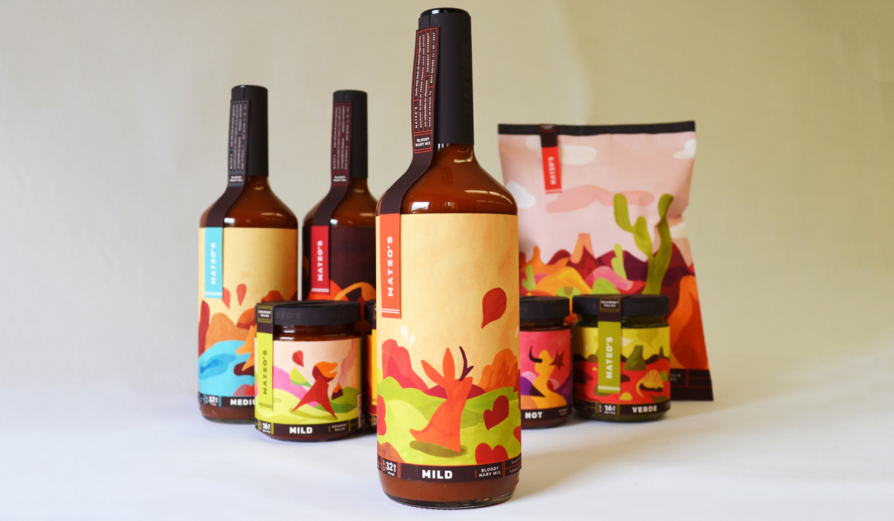
Determing the type of animal, their shape, level of detail and posture for each illustration was very important for establishing a consistent brand narrative. The animals are based on actual animals found in the Texas landscape with occasional references to mythical animals like the Jackalope. The animals are paired with the different products based on the heat level and general atmosphere of both the animal and the product, for example a young roadrunner is paired with Mateo's mild salsa, while the more intense flavor of the very hot bloody mary mixer is represented by a scorpion.

Color

The colors within the backgrounds of the illustrations are also used to indicate the products heat levels. The jackalope on the mild bloody mary mix lives in a calm landscape of green, in contrast to the rich raspberry pink sky behind the minotaur-esque figure on the label for the hot salsa. Each package also has a tag which displays the brand name on a unique color derived from an element within that label's illustration.