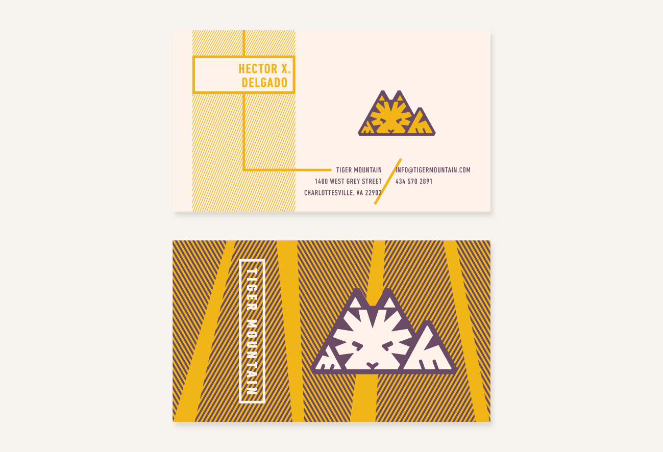
Identity System
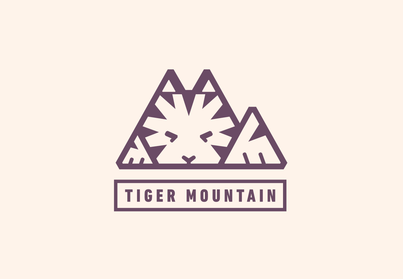
Tiger Mountain is a games company with a focus on creating unique experiences for players, the identity mark is crisp with mathmatical refinements which reflect the companies commitment to crafting quality games.
The Mark
The mark is created form the forced connection between the two parts of the company name. I wanted to convey the idea that the company puts great care into refining every aspect of the games it publishes through the consistent geometry and symetries of the mark. The face of the tiger in the mountain is also designed to appear deep in thought, portraying both the intellectual rigor that goes into making a board or card game, and the emotions of a player carefully considering their next move.
Typography
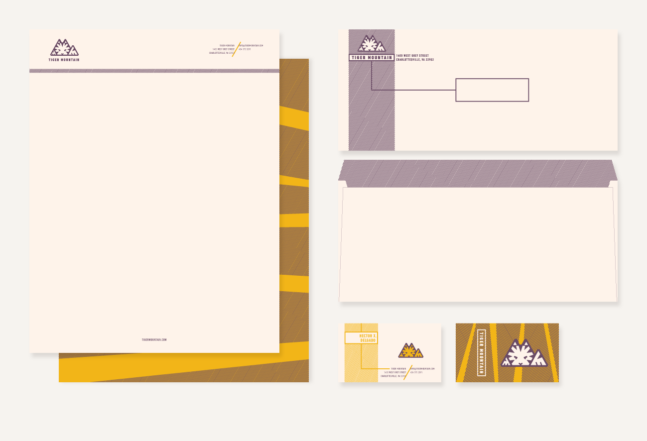
The typography is used in a minmalist way, I didn't want the brand to become over complicated as it will primarily live as a mark and type lockup on the side of a game box which will need to be easily recognizable by boardgame customers. I used a single typeface for the entire stationery system and focused on giving each element heirarchy through the application of color, scale and supporting graphic elements rather than mixing typefaces.
Color
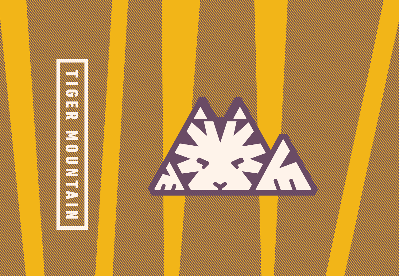
The color was inspired by the colors of Tiger Mountain's namesakes, but tweaked to work together an appealing and sophisticated way. The purple comes from the idea of distant mountains seen through an atmospheric distortion turning them into a rich purple, while the Tiger, rather than intense orange, is conveyed through a warm golden yellow. When paired together the two colors active each other in the same way a tiger's stripe pattern does.
Graphic Elements
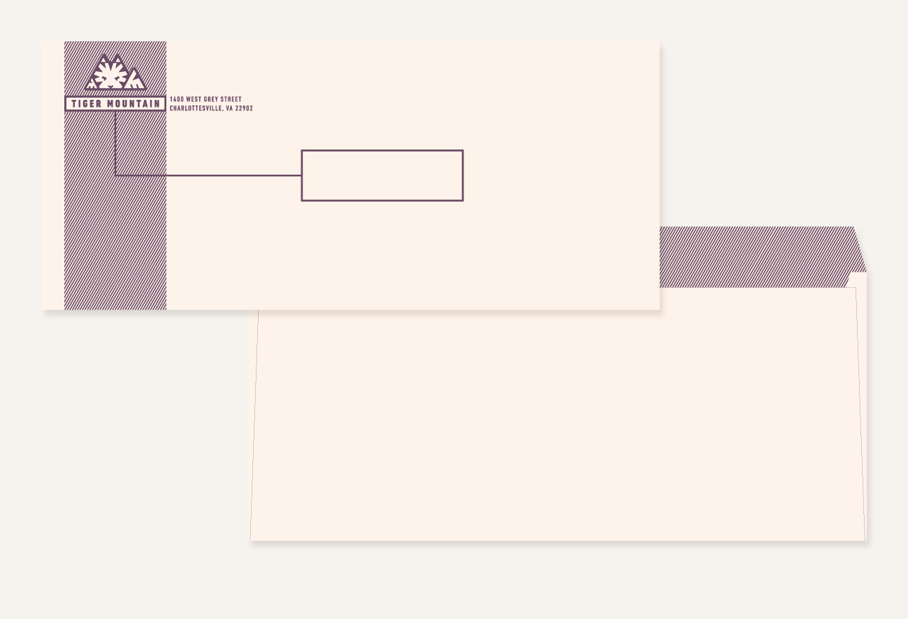
Two main graphic elements are repeated thorughout the Tiger Mountain system. The first is a stripe pattern which matches the angles of the identity mark, and is a reference to the stripes of the tiger. The stripes are usually very thin and closely spaced which again references the detail oriented nature of the company. The second element which repeats is the rectangular lock up and trail lines which are abstractions of the tiles of a boardgame and the flow of play.


