Magazine Spreads
I was very excited to work on this project because Kafka is one of my favorite writers. This story was interesting to work with because of the way it unfolds, it's both straightforward but also enigmatic.
Concept
I chose to focus on the confusion created by the mechanisms at work in the story. Kafka is excellent at creating confusing scenes, especially when beuracracy and systems of justice are involved. The great thing about the story is how many levels of incomprehensible automation there are, there's an execution machine which inscribes the rule a criminal has broken onto their body.
Approach
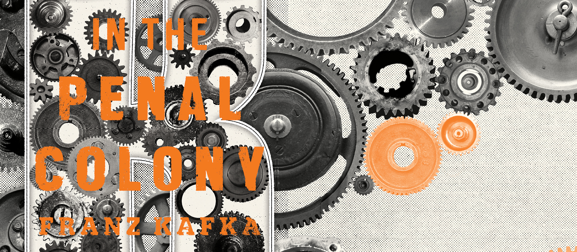
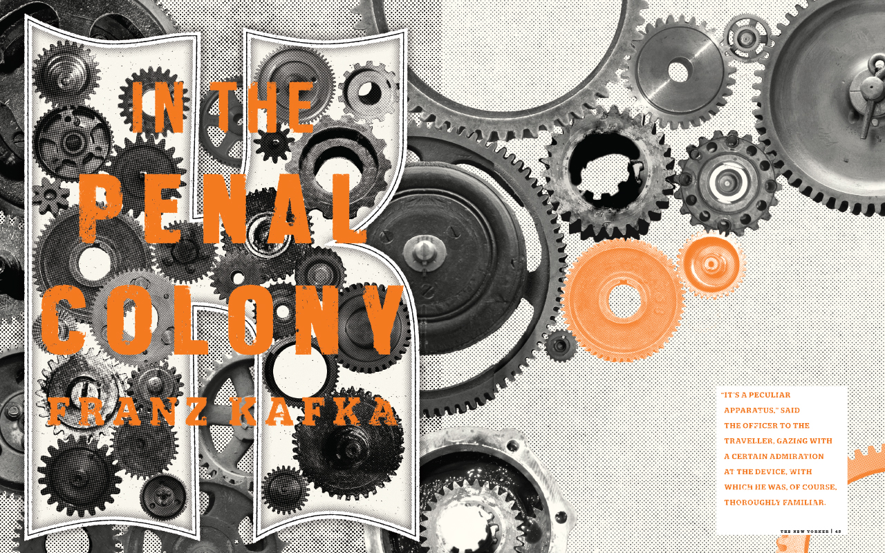
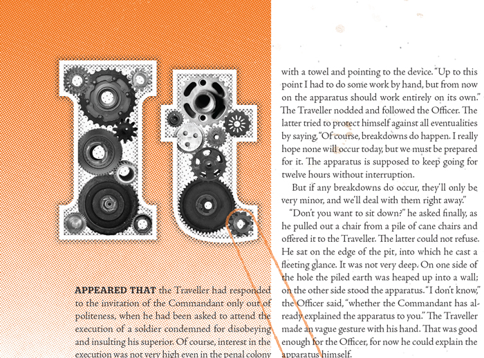
In order to recreate the confusion of the story visually I chose to focus on the internal aspects of the machine itself as a metaphor for a broken justice system. Kafka describes the machine falling apart with gears churning out of place and flying out of the wreck. I wanted to incorporate the gears into the images along with the type and overall page structure.
Typography
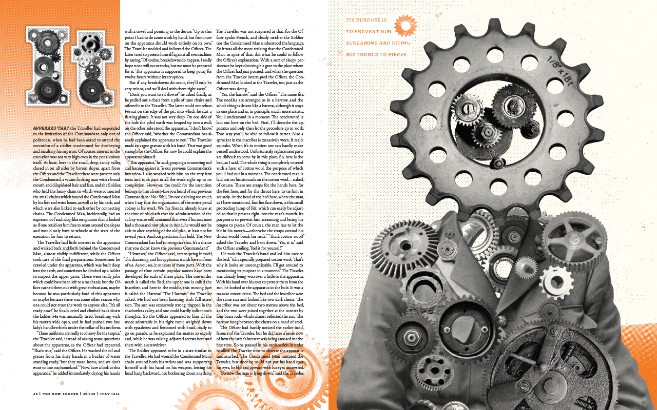
The larger typographic elements are all distressed to show the disrepear of the machine and the society which it is meant to support. On the opening spread I chose to build a monunemntal K as an homage to Kafka's frequent use of the letter for his characters' names. The drop cap on the second spread is a minature version of the first page. I chose a slab serif for the larger components because I wanted to show the solidity of the justice process in the way the officer in the story describes it, but this is undermined by the texture which show the process of justice eroding. The body copy is set in an old-style serif typeface, I decided that the body copy should feel traditional and focus on readability because of the length of the story and the period during which it was written.
Imagery
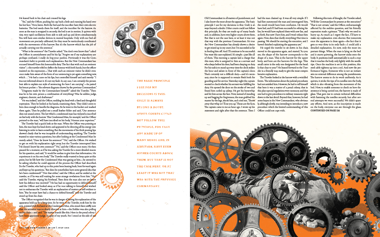
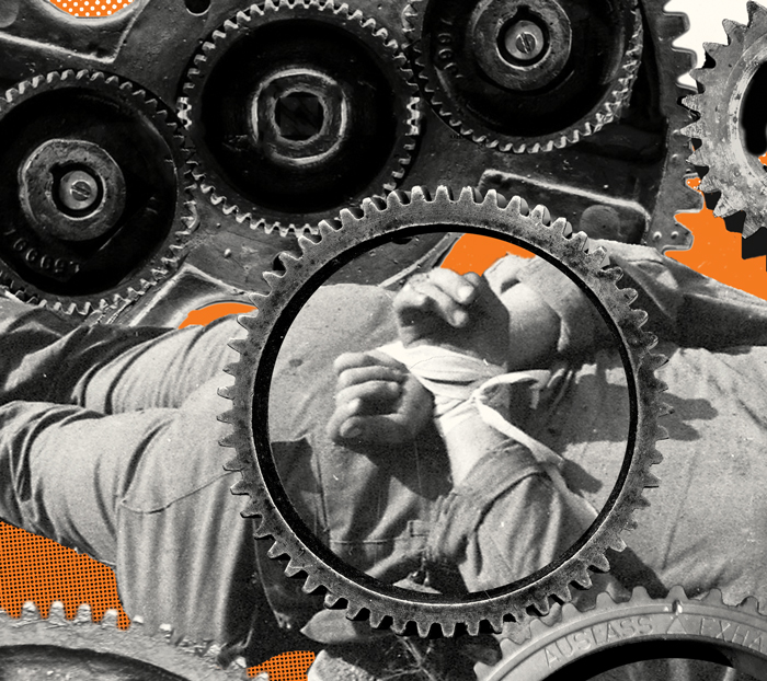
I used the gears from the typography in the images as well to continue the metaphor, here they are combined with human figures to show both the corruption of the character's humanity by the justice process and the effects it has upon the condemned.
Color
I chose to limit the color palette to primarily grayscale and a red orange; this limited palette is meant to reflect the simplicity of means in the colony. The red-orange was chosen because it adds a violent energy, and as a nod to the dada typographic two color posters which influenced the title treatment. The red orange was originally meant to be an over print but this was hurting readability.

