Identity and Stationery
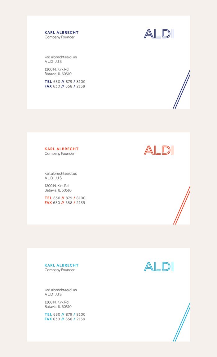
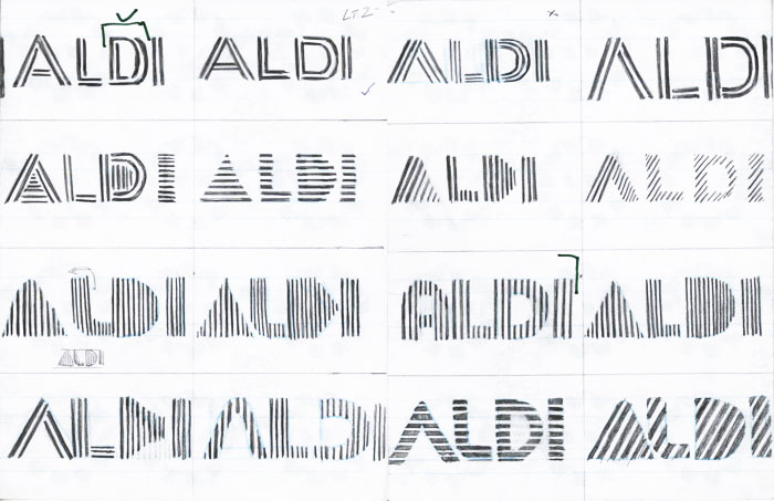
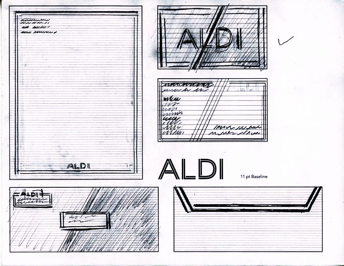
This redesign of the ALDI identity mark takes aspects of the old lettermark and works them into a new logotype which compliments their desire to simplify the shopping experience.
Concept
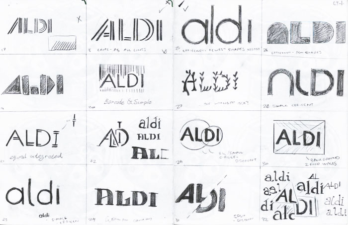
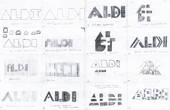
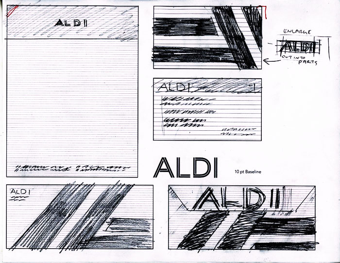
The main idea behind the new mark was to simplify the elements of the previous identity in a way that expresses simplicity and efficency. I wanted to strip out the excess of the original, but retain the recognizable elements.
Approach
I decided that the repeated lines and the color scheme should be retained to maintian the brand equity, but reordered how they were used.
Typography
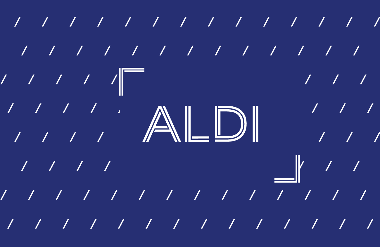
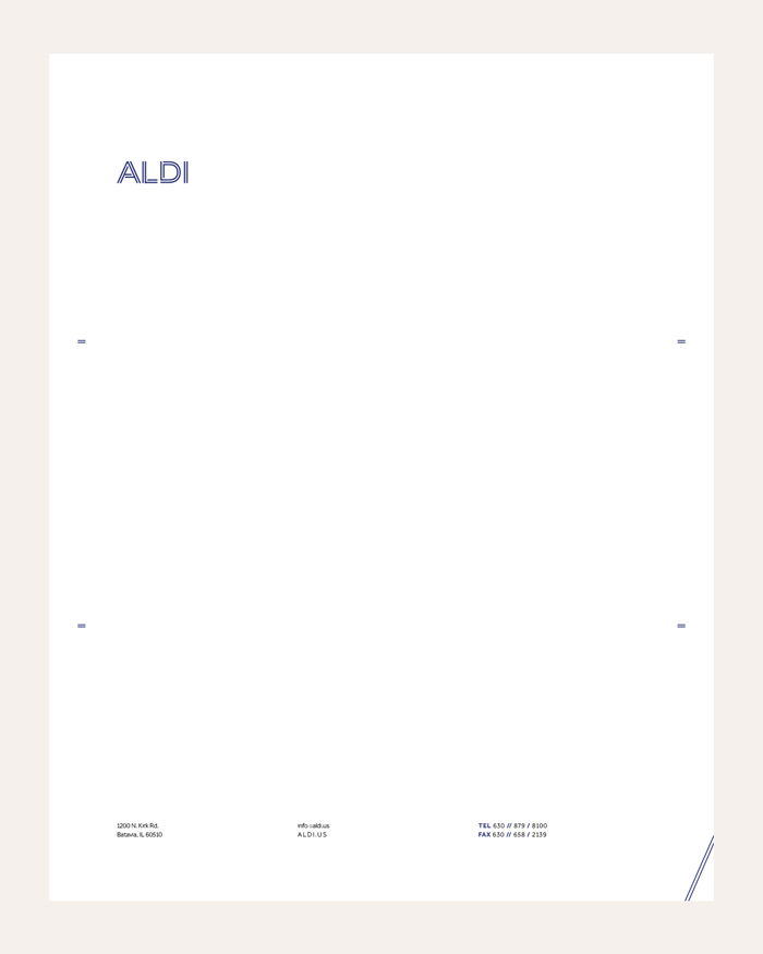
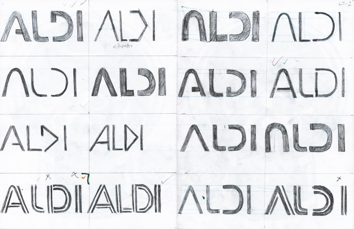
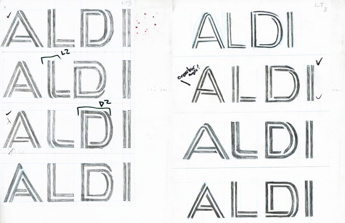
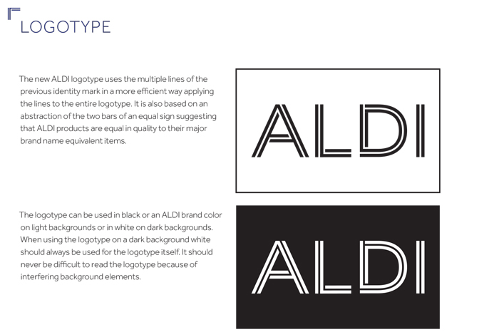
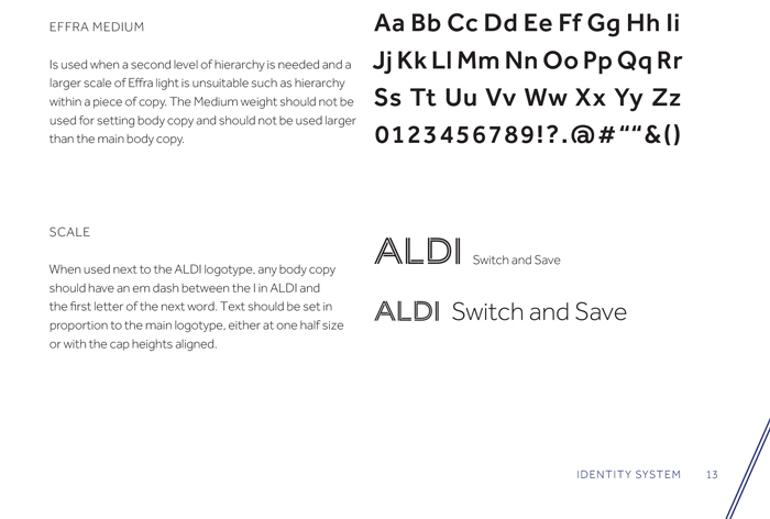
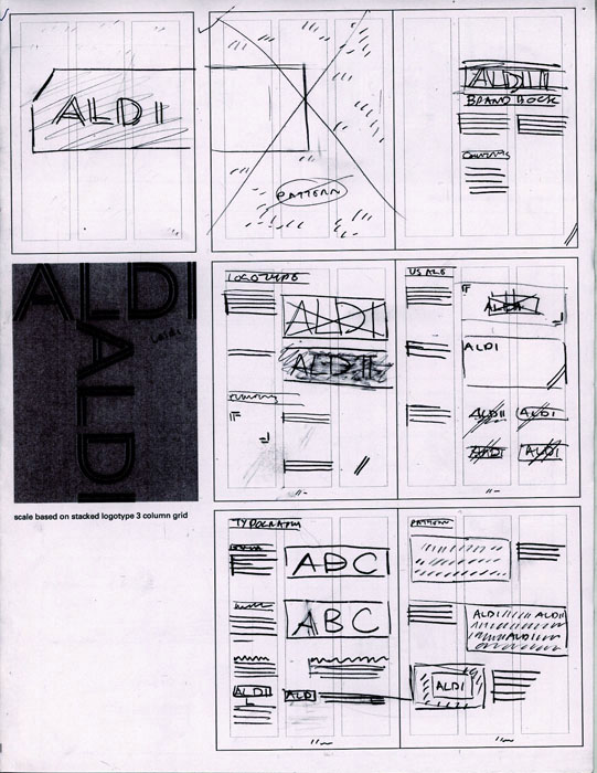
The new logotype was based on a sans-serif type and uses the lines from the lettermark from the previous design. The repeated line is now only repeated twice is now woven into the letterforms spelling out ALDI, the weaving is meant to represent how ALDI links efficency and value. This eliminated much of the unecessary excess of the original and reduced the mark's visual footprint while also giving it a more serious apperance.
Color
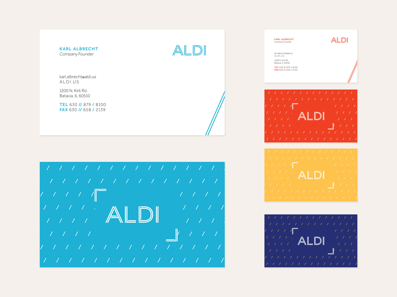
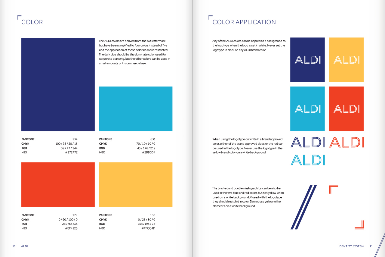
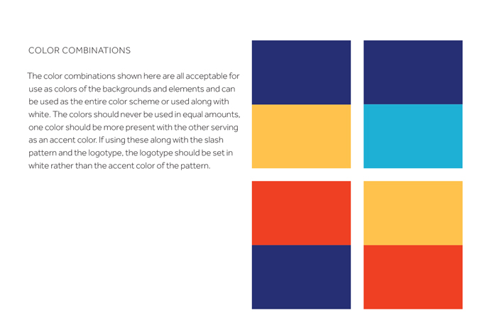
I decided to use the same colors except for orange from the existing logotype, but instead of having them all be featured in the logotype they would be used on their own throughout the different brand extensions. Because the dark blue color was already dominate it was chosen as the primary color to be used for both corporate branding and when the ALDI logotype needed to be immediately recognizable.
Additional Elements
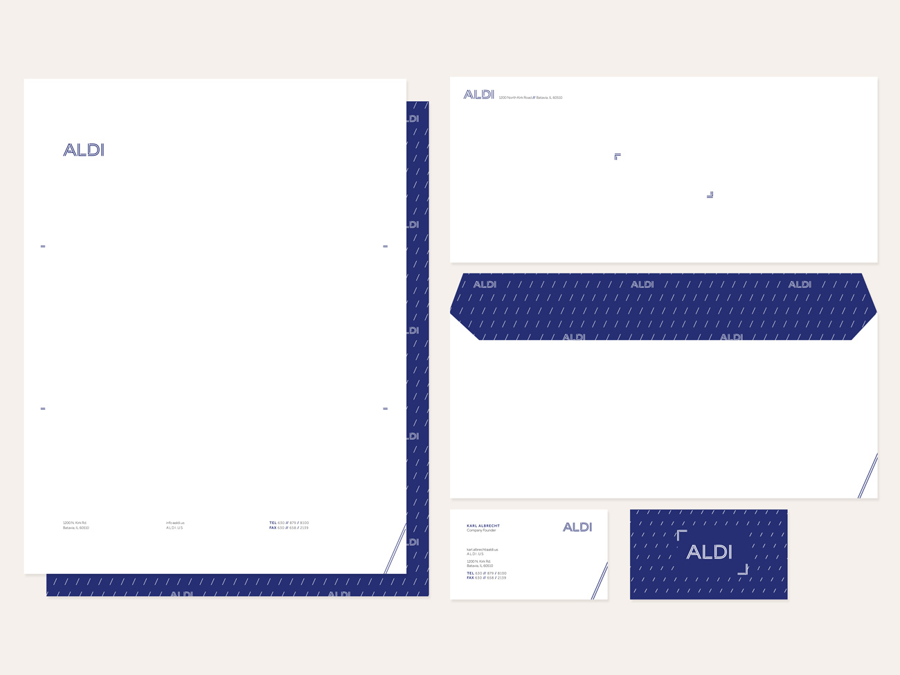
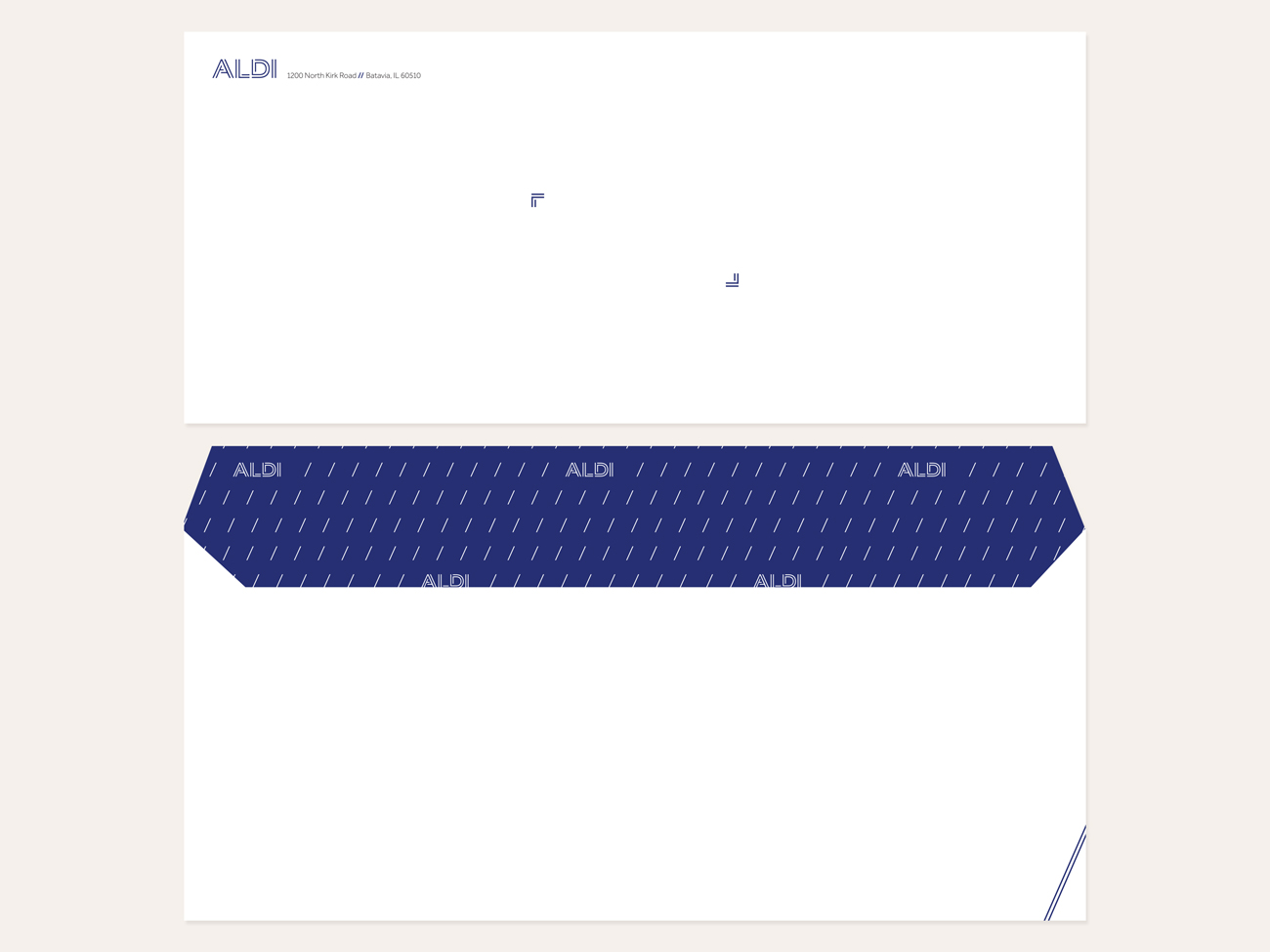
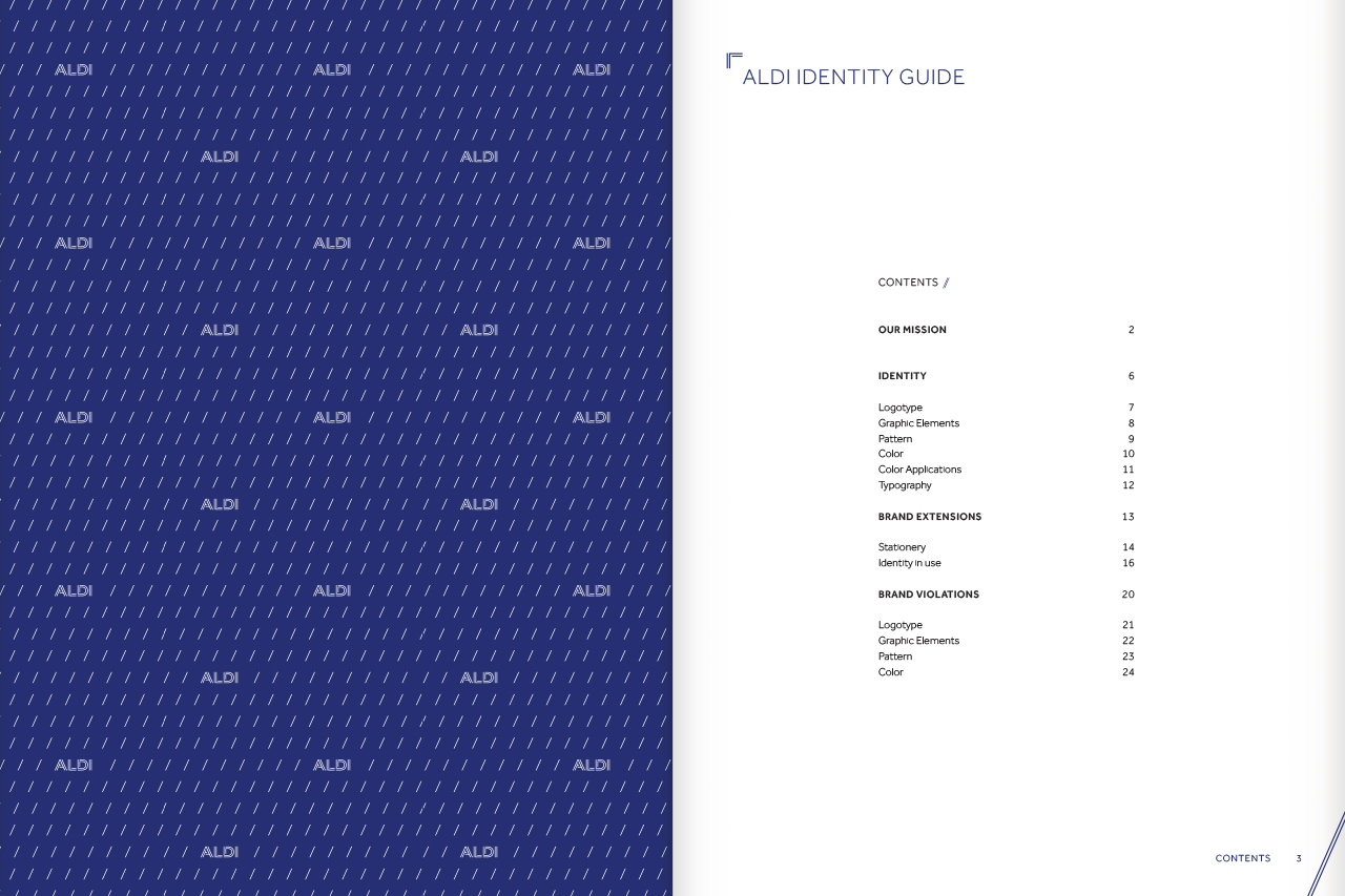
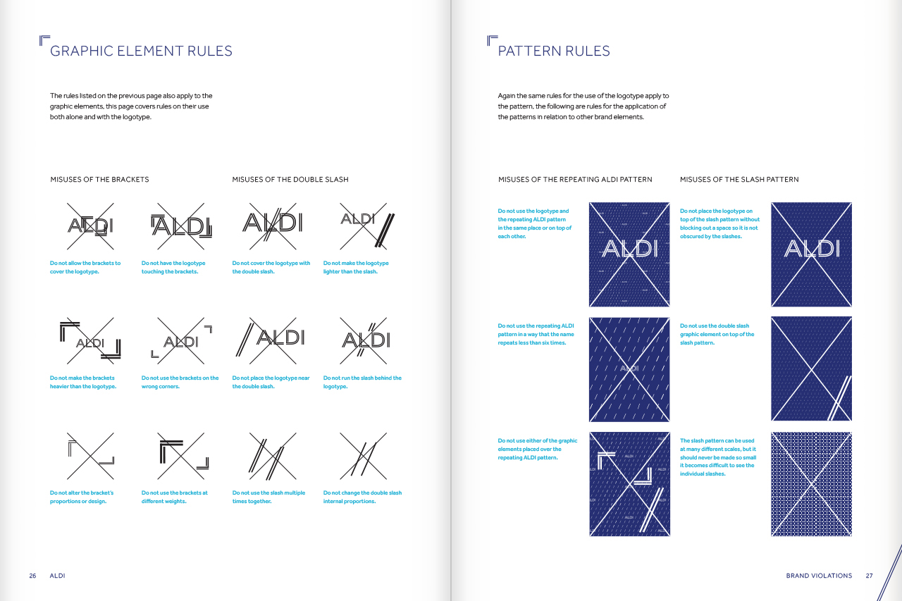
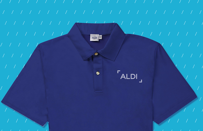
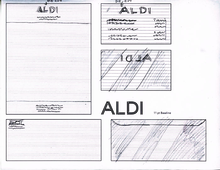
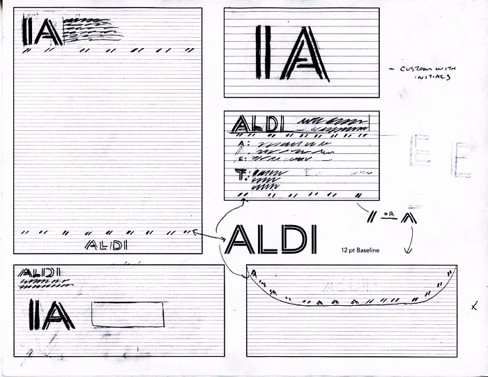
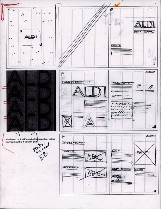
I used the same woven line to create corner brackets which appear in lock-up with the ALDI logotype. These help provide negative space around the logotype, but can also be used throughout the brand as a way to callout specific images. I also used a series of forward slashes which match the angle of the A as a repeating pattern that can be used for different applicationions of the ALDI brand.

